
Three Ships Whisky
We were tasked to refresh the corporate identity of Three Ships Whisk with a focus on highlighting the brand's precision and artisanal craftsmanship.
Three Ships Whisky
With a multitude of awards under its belt and an international reputation for excellence, Three Ships Whisky was a brand in need of a fresh, contemporary update to stay relevant to younger audiences.


CREDENTIALS STAMP:
We introduced a credentials stamp when awards communication was necessary and to keep the hierarchy of communication clean.

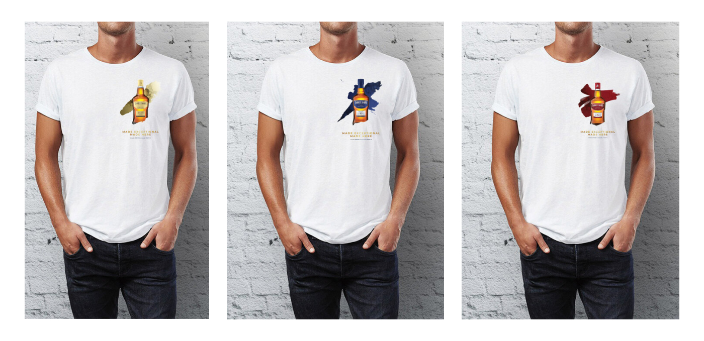
BRUSH STROKES:
By developing unique brush strokes which played off the craft element of the whisky, and using a modern colour palate pulled from the packaging, a contemporary and considered visual language was formed.


Before and After


